October 21, 2019
Rob Bailey
Data Wrangling and Data Exploration
0. Introduction
- The datasets I have chosen are about crimes per state in the United States, and the income and rent prices of each state as well. The reason I chose these datasets is because I am curious if there are striking correlations and relationships between these variables that can tell us more about crime rates in the United States, and why they might be higher in some states versus others.
One of these datasets came from the tidyr package and is the us_rent_income dataset. This dataset contains variables on each state’s estimated income and rent cost averages; in addition to this, it has included the 90% margin of error (moe) for verification of the data. The second dataset I’m using comes from statcrunch.com (owned and operated by Pearson) and is a dataset from 2005-2010 of crime rates (murder, rape, robbery, assault, burglary, etc.) per state in the US. In addition to this, there is information on college graduation rates, crime related expenditures, police expenditures, judicial expenditures, corrections expenditures, etc. Both of these datasets have some good variables to look into, and being able to look at correlation between income rates and crime rates in US states is an important matter.
Though these datasets are not from the same years, they should offer a glimpse into the relationships that rent and income have with crime rates in various states. The us_rent_income dataset is from 2017, and the state_crime dataset is from years ranging from 2005-2010.
1. Tidying: Rearranging
state_crime <- read.csv("~/Desktop/Rstudio/sds348_website/content/state_crime.csv")
state_incomerent <- environment(tidyr::us_rent_income)

# Split up the rent and income variables into columns with values, then take
# out 'moe' and 'GEOID'

incomerent <- us_rent_income %>% pivot_wider(names_from = "variable", values_from = "estimate") %>%
    select(-1, -3) %>% rename(state = NAME)

# Because both income and rent were set up to have specific values of 'moe'
# associated with them, when the variables were split apart by pivot_wider,
# it duplicated the state names, but not the data. So, half the state names
# had NAs for data. This is to remove the NAs:

incomerentna1 <- data.table(incomerent)[, lapply(.SD, function(x) x[order(is.na(x))])]

# This takes away the duplicate names of states and places it as its own
# Value

statena <- incomerentna1 %>% mutate(state) %>% distinct(state)

statena <- statena[-c(52), ]  #remove Puerto Rico, which is not a state and incomplete income data (NA)

# Change the classification of `statena` from a Value to a dataframe in the
# Global Environment

statena <- as.data.frame(statena)

# take Puerto Rico out of the income and rent dataset, too

incomerentna1 <- incomerentna1 %>% na.omit() %>% select(-c(52), )

# bind the list of state names to the income and rent dataset that has
# duplicated state names

incomerentna <- cbind(incomerentna1, state1 = statena$state)

# take out the duplicated state name column, reorganize the columns, then
# replace it with the unduplicated one (`statena`)

incomerentna <- incomerentna[, c(4, 1, 2, 3)]
incomerentna <- incomerentna %>% select(-state)

# rename the binded state variable to be 'state'

incomerentna <- incomerentna %>% rename(state = state1)

glimpse(incomerentna)
## Observations: 51
## Variables: 3
## $ state <fct> Alabama, Alaska, Arizona, Arkansas, California, Colorado,…
## $ income <dbl> 24476, 32940, 27517, 23789, 29454, 32401, 35326, 31560, 4…
## $ rent <dbl> 747, 1200, 972, 709, 1358, 1125, 1123, 1076, 1424, 1077, …First, what I did was separate the rent and income variables per state into separate columns with the incomerent data by pivot_wider. When I separated this, there were NA’s between the income values and rent values, because there were the associated margin of errors for each one. To avoid double readings of states (because of the attached moe to each variable of rent and income), I took out the margin of error variable. The potential issue of taking away the margin of error readings is that there will now be no way to account for the accuracy of the medians for income and rent of each state. After doing this, I took out the “GEOID” variable, because I’m only using state names to classify the states.
2. Joining/Merging
crimeincomejoin <- full_join(state_crime, incomerentna, by = "state") %>% select(-medianinc) %>%
    filter(state != "District of Columbia")

glimpse(crimeincomejoin)
## Observations: 50
## Variables: 23
## $ state <fct> Alabama, Alaska, Arizona, Arkansas, California, Col…
## $ stabbr <fct> AL, AK, AZ, AR, CA, CO, CN, DE, FL, GA, HI, ID, IL,…
## $ pop <int> 4661900, 686293, 6500180, 2855390, 36756666, 493945…
## $ murder <dbl> 7.6, 4.1, 6.3, 5.7, 5.8, 3.2, 3.5, 6.5, 6.4, 6.6, 1…
## $ rape <dbl> 34.7, 64.3, 25.7, 48.9, 24.2, 42.5, 19.3, 41.9, 32.…
## $ robbery <dbl> 157.6, 94.0, 149.2, 95.8, 188.8, 68.1, 111.6, 210.5…
## $ assault <dbl> 253.0, 489.6, 265.9, 353.1, 285.0, 229.3, 163.5, 44…
## $ propertycr <dbl> 4082.9, 2932.3, 4291.0, 3835.1, 2940.3, 2849.0, 245…
## $ burglary <dbl> 1081.3, 472.1, 868.9, 1180.0, 647.1, 572.0, 428.7, …
## $ larceny <dbl> 2713.0, 2221.5, 2849.5, 2427.1, 1769.4, 2003.3, 177…
## $ vehtheft <dbl> 288.7, 238.7, 572.6, 228.0, 523.8, 273.7, 256.0, 29…
## $ unemp <dbl> 11.0, 8.6, 9.6, 7.8, 12.6, 7.9, 9.2, 9.2, 12.3, 10.…
## $ hsgrad <dbl> 80.9, 91.7, 85.8, 81.4, 80.4, 89.3, 90.0, 86.9, 86.…
## $ collgrad <dbl> 19.8, 28.6, 28.0, 17.5, 30.6, 35.5, 36.8, 25.6, 25.…
## $ pop1000_2005 <int> 4558, 664, 5939, 5939, 36132, 4665, 3510, 844, 1779…
## $ totjustice <int> 387, 841, 603, 603, 815, 539, 559, 700, 640, 493, 5…
## $ police <int> 181, 311, 258, 258, 340, 255, 238, 282, 317, 190, 2…
## $ judicial <int> 74, 231, 130, 130, 203, 92, 155, 160, 113, 99, 192,…
## $ corrections <int> 133, 299, 215, 215, 272, 192, 165, 258, 211, 204, 1…
## $ netelectric <dbl> 137.9, 6.6, 101.5, 47.8, 200.3, 49.6, 33.5, 8.1, 22…
## $ unleadedgas <dbl> 3.24, 3.35, 3.27, 3.21, 3.66, 3.23, 3.35, 3.19, 3.3…
## $ income <dbl> 24476, 32940, 27517, 23789, 29454, 32401, 35326, 31…
## $ rent <dbl> 747, 1200, 972, 709, 1358, 1125, 1123, 1076, 1077, …After the datasets were tidied up a bit, I conducted a full_join between incomerentna and state_crime by ‘state’. The issue that I came across was the differences in income variables between the two datasets. The “medianinc” variable in state_crime is the median income for a family of 4 in 2005, and these medians are substantially higher than the median income per capita, which is where the “income” variable comes from in the incomerentna dataset. For this reason, I’m going to be using the “income” variable from incomerentna, because I believe income per capita is a more representative value of income crime rates per state. The potential issue associated with dropping the “medianinc” value is that there will be no way to know the median income per household in these states, but in each state, there are generally more individual/autonomous adults than there are number of family units. Family units tend to make higher median incomes, because they have children to provide for, whereas individual adults have to only provide for themselves. In addition to this, I removed the ‘District of Columbia’ data, because D.C. is not a state. Although it would be interesting to view crime and income in these areas, I feel I would have to also include all other U.S. territories to be fair.
3. Wrangling
Population sizes of each state in descending order
crimeincomejoin %>% select(state, pop, income) %>% arrange(desc(pop)) %>% glimpse()## Observations: 50
## Variables: 3
## $ state <fct> California, Texas, New York, Florida, Illinois, Pennsylva…
## $ pop <int> 36756666, 24326974, 19490297, 18328340, 12901563, 1244827…
## $ income <dbl> 29454, 28063, 31057, 25952, 30684, 28923, 27435, 26987, 2…High school graduation rates per state in descending order
crimeincomejoin %>% select(state, hsgrad) %>% arrange(desc(hsgrad)) %>% glimpse()## Observations: 50
## Variables: 2
## $ state <fct> Minnesota, Utah, Montana, New Hampshire, Alaska, Washingt…
## $ hsgrad <dbl> 92.7, 92.5, 92.1, 91.9, 91.7, 91.5, 91.4, 91.2, 90.4, 90.…Unemployment rates per state in descending order
crimeincomejoin %>% select(state, pop, income, unemp) %>% arrange(desc(unemp)) %>%
    glimpse()
## Observations: 50
## Variables: 4
## $ state <fct> Michigan, Nevada, California, Rhode Island, Florida, Sout…
## $ pop <int> 10003422, 2600167, 36756666, 1050788, 18328340, 4479800, …
## $ income <dbl> 26987, 29019, 29454, 30210, 25952, 25454, 30684, 22766, 2…
## $ unemp <dbl> 14.1, 13.4, 12.6, 12.6, 12.3, 12.2, 11.5, 11.5, 11.1, 11.…Total justice expenditures per state in descending order
crimeincomejoin %>% select(state, pop, totjustice, income) %>% arrange(desc(totjustice)) %>%
    glimpse()
## Observations: 50
## Variables: 4
## $ state <fct> Alaska, California, New York, Nevada, Delaware, New J…
## $ pop <int> 686293, 36756666, 19490297, 2600167, 873092, 8682661,…
## $ totjustice <int> 841, 815, 802, 718, 700, 691, 642, 640, 603, 603, 603…
## $ income <dbl> 32940, 29454, 31057, 29019, 31560, 35075, 37147, 2595…expendprobs <- crimeincomejoin %>% mutate(totexpend = totjustice - police -
judicial - corrections) %>% group_by(state, pop, totjustice, police, judicial,
corrections, totexpend) %>% arrange(desc(totexpend != 0)) %>% summarize(expendmiscalc = totexpend !=
0) %>% arrange(desc(expendmiscalc == TRUE))The dataset I created here shows the miscalculations in total expenditures of each state. These errors in total state justice expenditures most likely came from rounding errors since they are all either + or - 1.
hsgradsnocoll <- crimeincomejoin %>% select(state, pop, hsgrad, collgrad) %>%
mutate(hsgrad - collgrad) %>% arrange(desc(hsgrad - collgrad))
glimpse(hsgradsnocoll)## Observations: 50
## Variables: 5
## $ state <fct> Wyoming, West Virginia, Montana, Wisconsin, …
## $ pop <int> 532668, 1814468, 967440, 5627967, 3002555, 1…
## $ hsgrad <dbl> 91.2, 82.5, 92.1, 90.4, 89.8, 87.9, 87.2, 89…
## $ collgrad <dbl> 23.4, 15.1, 25.4, 25.0, 24.5, 23.0, 22.6, 25…
## $ `hsgrad - collgrad` <dbl> 67.8, 67.4, 66.7, 65.4, 65.3, 64.9, 64.6, 64…Because everyone who goes to college has to have graduated highschool prior to acceptance, I was able to create a variable that shows how many highschool graduates do not end up graduating college. This rate statistic can be useful to understand the efficacy of the education path of each state, whether or not the people never attended college in the first place, or just didn’t finish a degree.
expendprobs <- crimeincomejoin %>% mutate(totexpend = totjustice - police -
    judicial - corrections) %>% group_by(state, pop, totjustice, police, judicial,
    corrections, totexpend) %>% arrange(desc(totexpend != 0)) %>% summarize(expendmiscalc = totexpend !=
    0) %>% arrange(desc(expendmiscalc == TRUE))
glimpse(expendprobs)## Observations: 50
## Variables: 8
## Groups: state, pop, totjustice, police, judicial, corrections [50]
## $ state <fct> Alabama, Connecticut, Florida, Hawaii, Idaho, Mass…
## $ pop <int> 4661900, 3501252, 18328340, 1288198, 1523816, 6497…
## $ totjustice <int> 387, 559, 640, 535, 453, 539, 562, 471, 414, 718, …
## $ police <int> 181, 238, 317, 210, 182, 246, 224, 193, 170, 324, …
## $ judicial <int> 74, 155, 113, 192, 95, 132, 114, 110, 81, 163, 165…
## $ corrections <int> 133, 165, 211, 134, 175, 162, 223, 167, 164, 230, …
## $ totexpend <int> -1, 1, -1, -1, 1, -1, 1, 1, -1, 1, 1, -1, 1, -1, -…
## $ expendmiscalc <lgl> TRUE, TRUE, TRUE, TRUE, TRUE, TRUE, TRUE, TRUE, TR…The dataset I created here shows the miscalculations in total expenditures of each state. These errors in total state justice expenditures might have come from rounding errors since they are all either + or - 1. Without the ability to know, however, I will treat them as miscalculations of expenditures. Only 17 out of the 50 states had these issues, so it was still a minority who had expenditure miscalculations.
crimestats <- crimeincomejoin %>% select(murder, rape, robbery, assault, propertycr,
    burglary, larceny, vehtheft) %>% psych::describe(quant = c(0.25, 0.75)) %>%
    as_tibble(rownames = "crime") %>% select(-n, -kurtosis) %>% glimpse()
## Observations: 8
## Variables: 14
## $ crime <chr> "murder", "rape", "robbery", "assault", "propertycr", "b…
## $ vars <int> 1, 2, 3, 4, 5, 6, 7, 8
## $ mean <dbl> 4.590, 32.316, 108.528, 253.686, 3094.036, 685.486, 2138…
## $ sd <dbl> 2.31748, 10.30735, 61.11541, 124.31020, 694.41144, 252.4…
## $ median <dbl> 4.45, 31.20, 101.85, 213.25, 2937.55, 629.60, 2151.70, 2…
## $ trimmed <dbl> 4.4775, 31.5000, 106.8400, 242.1950, 3104.5550, 675.6200…
## $ mad <dbl> 2.74281, 7.70952, 71.98023, 109.93479, 761.01858, 249.07…
## $ min <dbl> 0.5, 12.9, 11.2, 61.4, 1645.6, 302.2, 1244.0, 89.3
## $ max <dbl> 11.9, 64.3, 248.9, 539.1, 4291.0, 1210.1, 2849.5, 611.6
## $ range <dbl> 11.4, 51.4, 237.7, 477.7, 2645.4, 907.9, 1605.5, 522.3
## $ skew <dbl> 0.53674746, 0.79701270, 0.18464406, 0.69263703, -0.01140…
## $ se <dbl> 0.3277412, 1.4576788, 8.6430239, 17.5801166, 98.2046081,…
## $ Q0.25 <dbl> 2.625, 26.475, 68.500, 158.675, 2546.025, 489.225, 1794.…
## $ Q0.75 <dbl> 6.300, 36.500, 154.300, 319.650, 3644.100, 891.000, 2501…I sorted the data and split it up to where the main statistics of each crime are shown in a tibble. This is important for viewing things like the highest and lowest rates of certain crimes, among other things.
crimeincomejoin %>% select(c(murder, rape, robbery, assault)) %>% cor()## murder rape robbery assault
## murder 1.00000000 0.02061401 0.7271304 0.6780890
## rape 0.02061401 1.00000000 -0.1176149 0.3943797
## robbery 0.72713042 -0.11761490 1.0000000 0.5974077
## assault 0.67808899 0.39437965 0.5974077 1.0000000This shows the correlation of the more violent crimes with each other.
crimeincomejoin %>% select(c(larceny, vehtheft, propertycr, burglary)) %>% cor()## larceny vehtheft propertycr burglary
## larceny 1.0000000 0.5659009 0.9435132 0.7149107
## vehtheft 0.5659009 1.0000000 0.7225272 0.5960783
## propertycr 0.9435132 0.7225272 1.0000000 0.8857488
## burglary 0.7149107 0.5960783 0.8857488 1.0000000This shows the correlation of theft crime rates with each other. This matrix makes sense, because property crime rates and larceny are very highly correlated, as are burglary and property crimes.
crimeincomejoin %>% select(c(larceny, vehtheft, propertycr, burglary, rent,
    income)) %>% cor()
## larceny vehtheft propertycr burglary rent
## larceny 1.000000000 0.56590090 0.94351318 0.7149107 -0.004079912
## vehtheft 0.565900900 1.00000000 0.72252719 0.5960783 0.343349808
## propertycr 0.943513176 0.72252719 1.00000000 0.8857488 -0.010179106
## burglary 0.714910681 0.59607830 0.88574879 1.0000000 -0.186781940
## rent -0.004079912 0.34334981 -0.01017911 -0.1867819 1.000000000
## income -0.296431027 -0.04902878 -0.38554487 -0.5603419 0.702450410
## income
## larceny -0.29643103
## vehtheft -0.04902878
## propertycr -0.38554487
## burglary -0.56034191
## rent 0.70245041
## income 1.00000000This shows the correlation of crimes of theft category and rent and income. This insight is very interesting, because it shows that income and burglary are fairly strongly negatively correlated with each other.
crimeincomejoin %>% select(c(pop, police, judicial, corrections)) %>% cor()## pop police judicial corrections
## pop 1.0000000 0.4237253 0.2291556 0.3515293
## police 0.4237253 1.0000000 0.6775140 0.6715422
## judicial 0.2291556 0.6775140 1.0000000 0.5993265
## corrections 0.3515293 0.6715422 0.5993265 1.0000000These are correlations of the expenditures of the justice process with each other. As one would expect, these expenditures correlate pretty high with each other, because the more you spend on the judicial system, the more you spend on corrections. The more that is spent on police, the more is spent on the justice process, because chances are, more crimes are being caught with a larger police presence.
crimeincomejoin %>% group_by(state) %>% summarize(max(rent)) %>% arrange(desc(`max(rent)`)) %>%
    glimpse()
## Observations: 50
## Variables: 2
## $ state <fct> Hawaii, California, Maryland, New Jersey, Alaska, Ne…
## $ `max(rent)` <dbl> 1507, 1358, 1311, 1249, 1200, 1194, 1173, 1166, 1125…This summary statistic shows the highest averages of rent per state, in descending order.
crimeincomejoin %>% group_by(state) %>% summarize(max(income)) %>% arrange(desc(`max(income)`)) %>%
    glimpse()
## Observations: 50
## Variables: 2
## $ state <fct> Maryland, Connecticut, New Jersey, Massachusetts, …
## $ `max(income)` <dbl> 37147, 35326, 35075, 34498, 33172, 32940, 32734, 3…This summary statistic shows the highest median incomes of individual adults per state, in descending order.
crimeincomejoin %>% group_by(state) %>% mutate(incomeleft = income - netelectric -
    rent) %>% summarize(incomeleft) %>% glimpse()
## Observations: 50
## Variables: 2
## $ state <fct> Alabama, Alaska, Arizona, Arkansas, California, Color…
## $ incomeleft <dbl> 23591.1, 31733.4, 26443.5, 23032.2, 27895.7, 31226.4,…This value “incomeleft” is the income that the average person might have after taking into account the costs of rent and of net electric. I wanted to include prices of gas, but with the travel per person in each state varying so greatly, there isn’t a reliable statistic for the average distance traveled in gasoline-using machines, not to mention large differences in mpg’s.
4. Visualizing
ggplot(crimeincomejoin, aes(state, burglary)) + geom_bar(aes(y = burglary, fill = income),
    stat = "summary") + scale_fill_gradient(low = "dark blue", high = "light pink") +
    theme(axis.text.x = element_text(angle = 45, hjust = 1)) + scale_y_continuous() +
    ggtitle("Burglary Rates per state with Income data")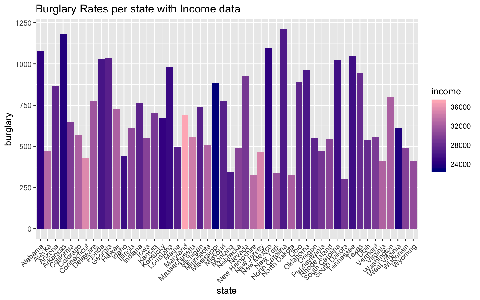
ggplot(crimeincomejoin, aes(state, burglary)) + geom_bar(aes(y = burglary, fill = rent),
    stat = "summary") + theme(axis.text.x = element_text(angle = 45, hjust = 1)) +
    scale_y_continuous() + ggtitle("Burglary Rates per state with Rent data")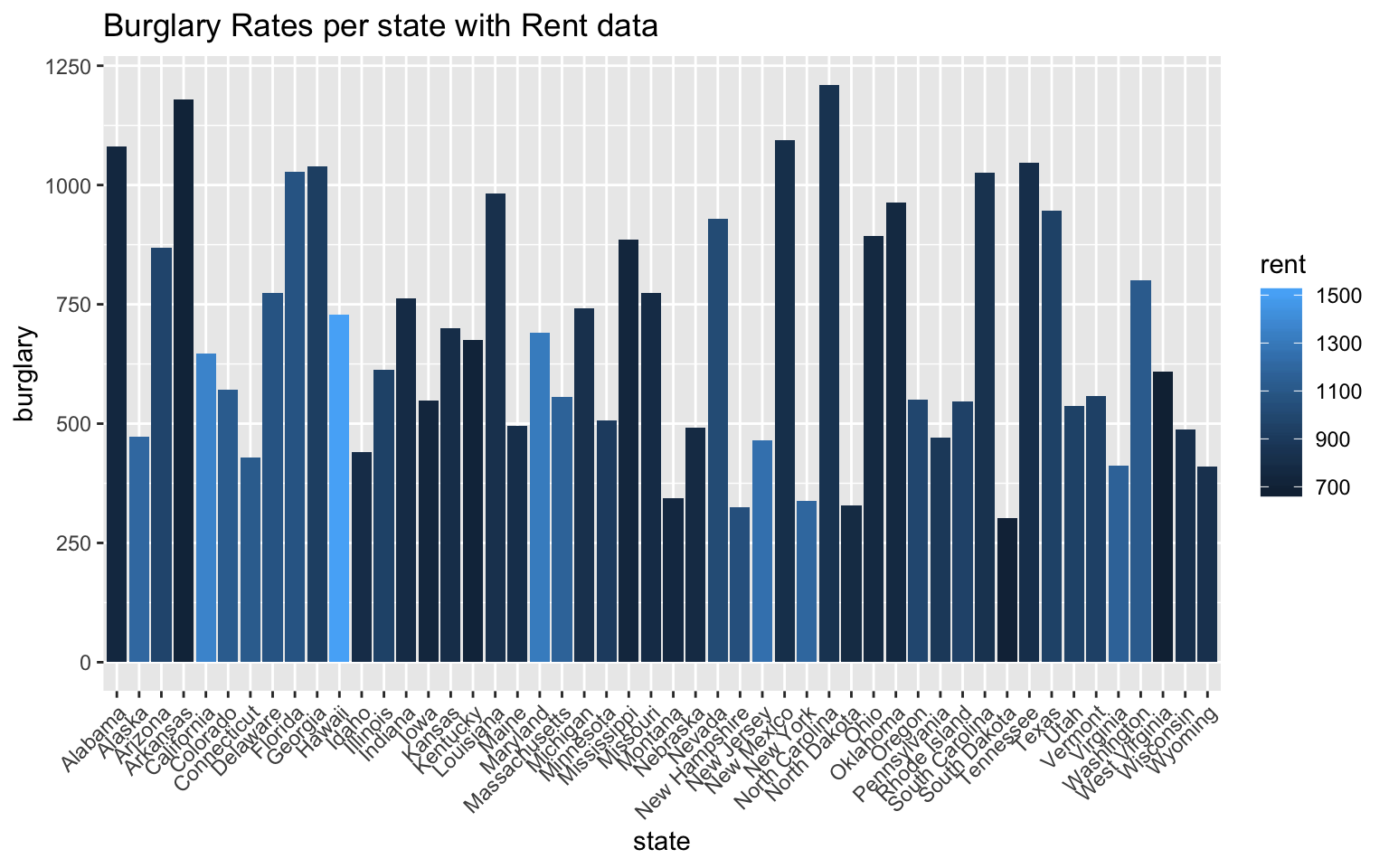
The first graph in this sequence represents the burglary rates per state with overlayed median income data of each state. From this graph, it seems clear that the states with high burglary rates have lower median incomes. On the contrary, the states with the highest median incomes have some of the lowest burglary rates. This data visualization was imporant, because this is the relationship I was expecting to find from merging these two datasets in the first place.
Below this graph, I included another bar graph comparing burglary rates per state with rent data. Rent prices tend to be lower in more impoverished areas, but this varies greatly with gentrification of areas and states with huge socio-economic gaps. From this graph, however, one can see that the states with higher burglary rates have lower average rent prices.
Of course there are other crime statistics that I did not include in this visual representation, but burglary is one of the crimes in crimeincomejoin that is nonviolent and is a representation of theft rates.
ggplot(crimeincomejoin, aes(state, collgrad)) + geom_bar(aes(y = collgrad, fill = income),
    stat = "identity") + theme(axis.text.x = element_text(angle = 45, hjust = 1)) +
    scale_y_continuous() + ggtitle("College Graduation rates per state with Median Income data")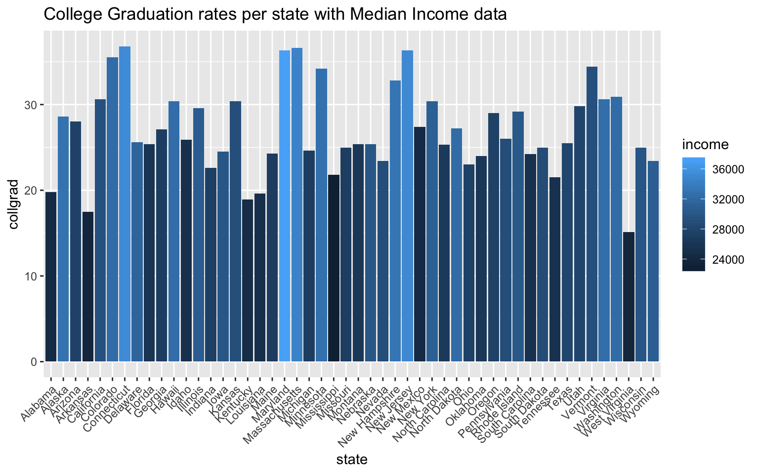
The graph above shows the graduation rates per state with income data overlayed into each bar on the graph. The relationship that becomes apparent once this is done is the positive correlation between high college graduation rates and high median income values. Because college graduation rate is already a rate per state, I chose to use “stat=”identity“”. Connecticut, Maryland, Massachusetts, and New Jersey have the top college graduation rates out of the 50 states, and by coloration, they all have the highest median incomes. What’s interesting to me about this relationship is that these states aren’t states that have exceptionally high population rates. College acceptance rates for bigger states are more competitive, and because college acceptance rates ultimately effect college graduation rates, the larger states have lower college graduation rates. With these datasets, I can’t quite test some of these assumptions, but from this graph, the two biggest states by population, California and Texas, don’t have the highest college graduation rates.
5. Dimensionality Reduction
cij1 <- crimeincomejoin %>% select(-c(state, stabbr, pop1000_2005, police, judicial,
    corrections, unleadedgas, netelectric, totjustice, pop, unemp))
cij_nums <- cij1 %>% select_if(is.numeric) %>% scale
rownames(cij_nums) <- cij1$state
cij_pca <- princomp(cij_nums)
names(cij_pca)
## [1] "sdev" "loadings" "center" "scale" "n.obs" "scores"
## [7] "call"summary(cij_pca, loadings = T)## Importance of components:
## Comp.1 Comp.2 Comp.3 Comp.4 Comp.5
## Standard deviation 2.3242886 1.6293879 1.127912 0.93605773 0.65466378
## Proportion of Variance 0.4593808 0.2257572 0.108179 0.07450715 0.03644427
## Cumulative Proportion 0.4593808 0.6851380 0.793317 0.86782415 0.90426842
## Comp.6 Comp.7 Comp.8 Comp.9
## Standard deviation 0.57563799 0.49051392 0.44312371 0.39072410
## Proportion of Variance 0.02817679 0.02045952 0.01669716 0.01298174
## Cumulative Proportion 0.93244522 0.95290473 0.96960189 0.98258364
## Comp.10 Comp.11 Comp.12
## Standard deviation 0.3481967 0.289094235 5.783717e-05
## Proportion of Variance 0.0103096 0.007106758 2.844505e-10
## Cumulative Proportion 0.9928932 1.000000000 1.000000e+00
##
## Loadings:
## Comp.1 Comp.2 Comp.3 Comp.4 Comp.5 Comp.6 Comp.7 Comp.8 Comp.9
## murder 0.356 0.250 0.249 0.361 0.373 0.123 0.549
## rape -0.165 -0.677 0.493 -0.291 0.183 -0.277 0.179
## robbery 0.293 0.312 0.238 0.218 0.184 -0.409 -0.476 -0.261
## assault 0.324 0.103 -0.217 0.427 0.367 0.184 -0.392 0.447 -0.312
## propertycr 0.384 -0.190 -0.354
## burglary 0.396 -0.125 -0.121 0.135 0.320 -0.244 -0.515
## larceny 0.322 -0.282 -0.512 0.205 0.228 -0.173 -0.107 0.295
## vehtheft 0.296 0.306 -0.482 -0.561 0.417 0.160
## hsgrad -0.284 0.125 -0.484 -0.195 0.422 -0.461 -0.116
## collgrad -0.202 0.472 0.310 0.596 0.308 -0.232
## income -0.233 0.458 0.121 0.192 -0.348 0.228
## rent 0.548 -0.335 0.303 -0.427 -0.111
## Comp.10 Comp.11 Comp.12
## murder 0.264 0.298
## rape 0.124 -0.129
## robbery 0.195 -0.422
## assault -0.192
## propertycr 0.815
## burglary 0.519 -0.296
## larceny -0.311 -0.477
## vehtheft -0.199 -0.143
## hsgrad 0.340 0.332
## collgrad 0.115 -0.336
## income -0.682 0.192
## rent 0.442 0.300eigval <- cij_pca$sdev^2 #square to convert SDs to eigenvalues
varprop = round(eigval/sum(eigval), 2) #proportion of var explained by each PC
# scree plot to visually show variance that is explained by each PC group
ggplot() + geom_bar(aes(y = varprop, x = 1:12), stat = "identity") + xlab("") +
geom_path(aes(y = varprop, x = 1:12)) + geom_text(aes(x = 1:12, y = varprop,
label = round(varprop, 2)), vjust = 1, col = "white", size = 5) + scale_y_continuous(breaks = seq(0,
0.6, 0.2), labels = scales::percent) + scale_x_continuous(breaks = 1:10)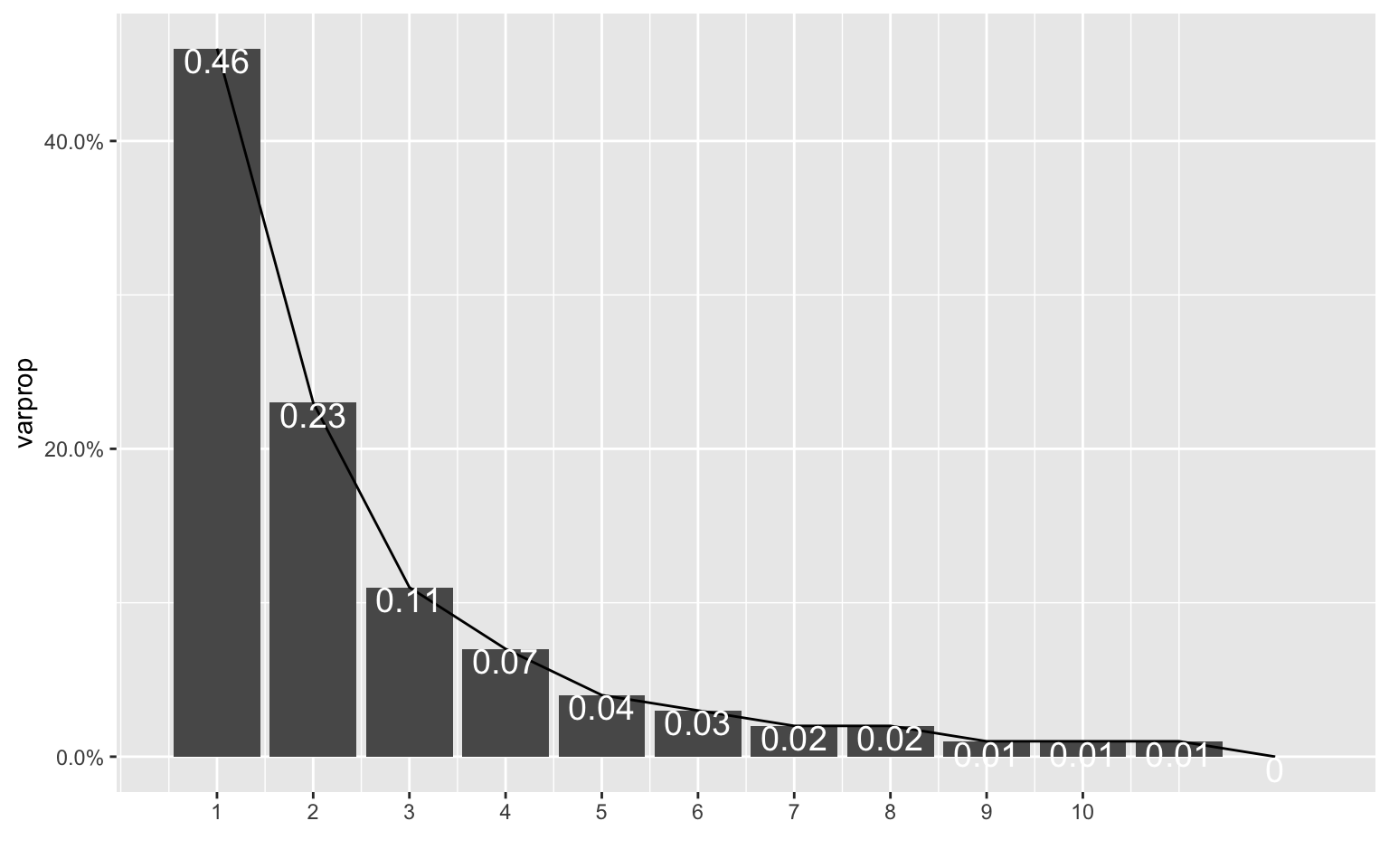
round(cumsum(eigval)/sum(eigval), 2) #cumulative proportion of variance## Comp.1 Comp.2 Comp.3 Comp.4 Comp.5 Comp.6 Comp.7 Comp.8 Comp.9
## 0.46 0.69 0.79 0.87 0.90 0.93 0.95 0.97 0.98
## Comp.10 Comp.11 Comp.12
## 0.99 1.00 1.00eigval #eigenvalues## Comp.1 Comp.2 Comp.3 Comp.4 Comp.5
## 5.402318e+00 2.654905e+00 1.272185e+00 8.762041e-01 4.285847e-01
## Comp.6 Comp.7 Comp.8 Comp.9 Comp.10
## 3.313591e-01 2.406039e-01 1.963586e-01 1.526653e-01 1.212409e-01
## Comp.11 Comp.12
## 8.357548e-02 3.345138e-09eigen(cor(cij_nums))## eigen() decomposition
## $values
## [1] 5.512569e+00 2.709087e+00 1.298148e+00 8.940858e-01 4.373313e-01
## [6] 3.381215e-01 2.455142e-01 2.003659e-01 1.557809e-01 1.237152e-01
## [11] 8.528110e-02 3.413406e-09
##
## $vectors
## [,1] [,2] [,3] [,4] [,5]
## [1,] -0.35572511 0.05243725 -0.25040060 0.24942410 0.361407226
## [2,] -0.08840982 -0.16518672 0.67715030 0.49300203 -0.291147904
## [3,] -0.29259873 0.31249453 -0.23848419 0.21752139 0.184295854
## [4,] -0.32434217 0.10286410 0.21707712 0.42658772 0.366596083
## [5,] -0.38414106 0.09287910 0.18984508 -0.35413587 -0.008684213
## [6,] -0.39626284 -0.04044911 0.02915647 -0.12501747 -0.121217684
## [7,] -0.32202034 0.09254130 0.28238579 -0.51203648 0.204665697
## [8,] -0.29625055 0.30552695 0.08090179 -0.05343902 -0.481571212
## [9,] 0.28353752 0.12493557 0.48439085 -0.19523430 0.422131249
## [10,] 0.20218698 0.47231082 0.08846381 -0.04338094 0.009869002
## [11,] 0.23301976 0.45842387 0.07966296 0.12146058 0.192379487
## [12,] 0.05665779 0.54837734 -0.05277508 0.06792875 -0.335246159
## [,6] [,7] [,8] [,9] [,10]
## [1,] -0.04404761 -0.372611771 0.12300046 0.54886207 -0.26351383
## [2,] -0.06623337 -0.182850346 -0.27711936 0.17864528 -0.12350718
## [3,] 0.40850781 0.018301696 -0.47636397 -0.26127985 -0.19500569
## [4,] -0.18409815 0.391621111 0.44658874 -0.31191369 0.19165631
## [5,] -0.08392753 -0.022930909 -0.07818342 0.01329504 0.06017813
## [6,] -0.13519037 -0.319841975 -0.24409840 -0.51467594 0.08960094
## [7,] -0.22755960 0.172552029 -0.10696918 0.29474199 -0.01248162
## [8,] 0.56119471 -0.043160735 0.41735057 0.16047885 0.19938434
## [9,] 0.46087899 -0.005334993 0.04314297 -0.11565223 -0.33970211
## [10,] -0.31041626 -0.595789258 0.30825400 -0.23237040 -0.11531452
## [11,] -0.02279290 -0.048586182 -0.34807909 0.22791761 0.68156611
## [12,] -0.30260838 0.426858859 -0.11113118 0.06532013 -0.44244786
## [,11] [,12]
## [1,] 0.297630659 -1.870718e-05
## [2,] -0.129468219 -1.231305e-05
## [3,] -0.422075032 1.640214e-05
## [4,] -0.002423939 2.230131e-05
## [5,] 0.011449656 -8.152722e-01
## [6,] 0.518924236 2.963192e-01
## [7,] -0.311027530 4.766142e-01
## [8,] 0.026847437 1.427061e-01
## [9,] 0.331631841 4.878524e-06
## [10,] -0.335560275 1.743792e-05
## [11,] 0.192152626 -1.022607e-05
## [12,] 0.300208908 -2.204473e-05cijdf <- data.frame(PC1 = cij_pca$scores[, 1], PC2 = cij_pca$scores[, 2])
ggplot(cijdf, aes(PC1, PC2)) + geom_point()
ggplot(cijdf, aes(PC1, PC2, PC3)) + geom_point() + stat_ellipse(data = cijdf[cijdf$PC1 >
    5, ], aes(PC1, PC2), color = "blue") + stat_ellipse(data = cijdf[cijdf$PC1 <
    -3.8, ], aes(PC1, PC2), color = "blue") + stat_ellipse(data = cijdf[cijdf$PC2 >
    2.75, ], aes(PC1, PC2), color = "red") + stat_ellipse(data = cijdf[cijdf$PC2 <
    -3.5, ], aes(PC1, PC2), color = "red")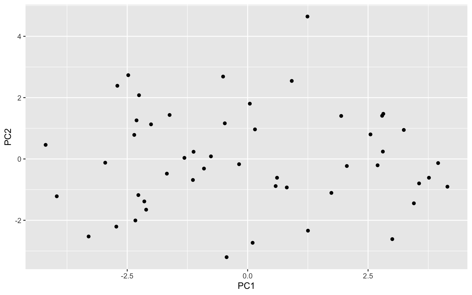
cij_pca$loadings[1:12, 1:2] %>% as.data.frame %>% rownames_to_column %>% ggplot() +
    geom_hline(aes(yintercept = 0), lty = 2) + geom_vline(aes(xintercept = 0),
    lty = 2) + ylab("PC2") + xlab("PC1") + geom_segment(aes(x = 0, y = 0, xend = Comp.1,
    yend = Comp.2), arrow = arrow(), col = "purple") + geom_label(aes(x = Comp.1 *
    1.1, y = Comp.2 * 1.1, label = rowname))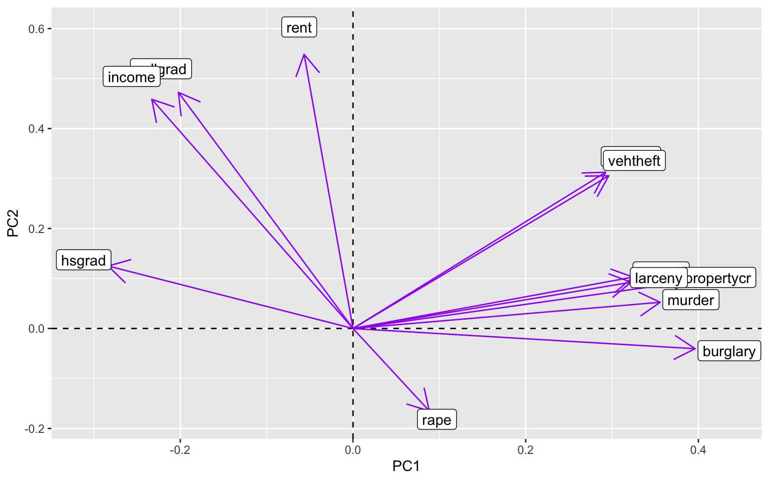
This process was largely influenced by the code we completed in WS11, and it was helpful in making these plots above. The datasets that I used for this project ended up being a lot less correlated with each other than I thought they would be. Based on the initial scree plot, the variance wasn’t tremendously explained by each PCA (PC1 explained approximately 46% of the variance). Because of this, the following scatterplot that was made with the first two PCs didn’t have enough data to creat ellipses over the PCs. This was also due to the small size of this dataset, but it was still disappointing to see. There were no defined clusters of points that could have been PCs, so the next graph to look at was a graph showing correlation between the variables of these PCs. This graph was pretty telling, because certain crimes are very correlated with each other, while other crimes are vrey far off from the others (e.g. rape). What was particularly interesting to me about this last graph was the high correlation of college graduation rates and median income values. The high correlation of rates of larceny, burglary, and property crimes also makes sense, because they can be intermingled when classifying crimes of theft. I still have a lot to learn about PCA and using eigenvalues, among other things, and I hope we get more chances to practice this in the future!
…